Launching the Lambda Island Redesign
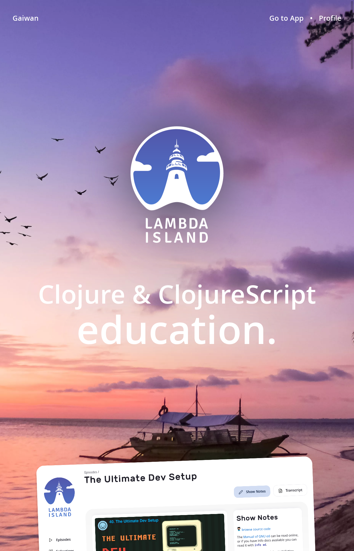
It’s finally live! A gorgeous, in-depth redesign of the Lambda Island website. After months of hard work we soft-launched earlier this week. Today we want to tell you a little more about the project, the whys and the hows, and to invite you to check it out. And when you’re done do come tell us what you think on our Discord.
We already told you in a previous post how Lambda Island and Gaiwan are changing. In a short amount of time we went from a one man endeavor to a team of six, drastically changing what we are able to take on and pull off.
Until last week the Lambda Island site still looked the way it did when we first launched five years ago. It’s what I cobbled together in early 2016, and shipped in a matter of months. It was functional, and had a certain DIY charm, but it was not a professional design by any means. Since Lambda Island is how the community knows us, and since the company is so much more than what it was back then, we felt an upgrade was long overdue.
What the site looked like in 2017
Felipe Barros took the lead on this, pitching design ideas from soon after he joined in 2019. I held off the boat for a while, but once we had reason to make new changes to the site we realized we could no longer continue on the existing basis. It was time for a clean slate: branding, design language, and implementation.
Felipe is a self-taught developer based in Recife, Brasil, and the first person to join what would become our budding team. He had done web design work in the past, creating static sites for local clients. These weren’t technically complex projects, but what I saw were clean and appealing designs, making good use of what the open web had to offer. I decided to bring Felipe on board.
To establish a fresh new brand identity we brought in Lubov Soltan, a professional UI/UX designer and brand specialist working out of Toronto, Canada. We worked with her in the past for Heart of Clojure and we were all excited to work together again. We settled on the lighthouse as a symbol, a guiding light to help you navigate the stormy waters on your Clojure journey, and building on the nautical theme of Lambda Island. Through several design iterations a beautiful logo emerged, with day and nighttime versions. Lubov also helped us establish branding guidelines, including colors and fonts.

Felipe took it from there, creating the UI design, but Lubov would stay on as a design consultant, meeting with Felipe every week to discuss his progress, and provide her professional input. We thought this way of collaborating worked really well. Rather than the designer throwing a Photoshop or Figma document over the wall for the dev to merely implement, this allowed Felipe to bring his own design sensibilities to bear, as well as his knowledge of the specific needs of the platform, accessibility and responsiveness foremost. Meanwhile he got to see how a trained designer reasons about these things. This helped Felipe to grow tremendously as a frontend developer and a UI designer throughout this project.
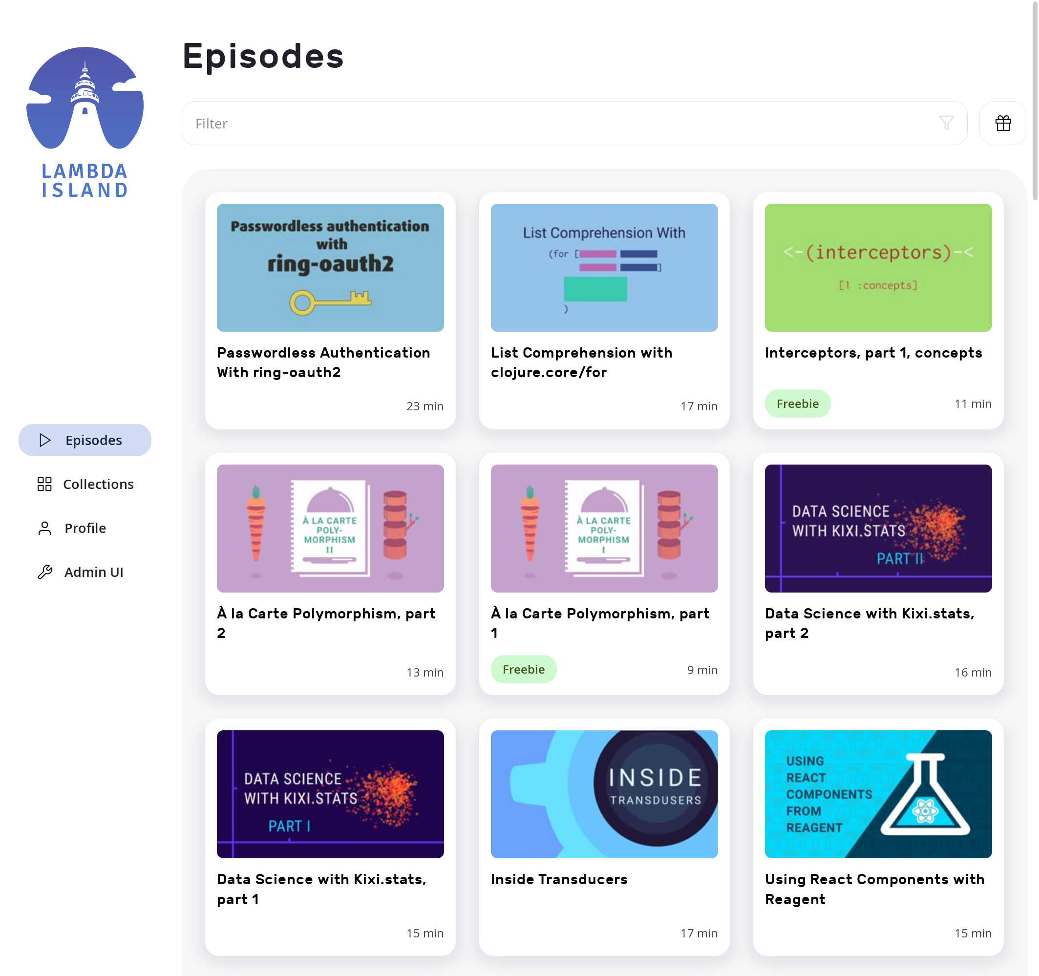
One source of inspiration were playing cards and collectible card games, and this is perhaps the most distinguishing feature of this new look. Instead of a long list, episodes are now smartly presented as cards in a grid. We also added some simple controls for filtering the episodes—a small quality of life improvement—making it easier to find what you are looking for.
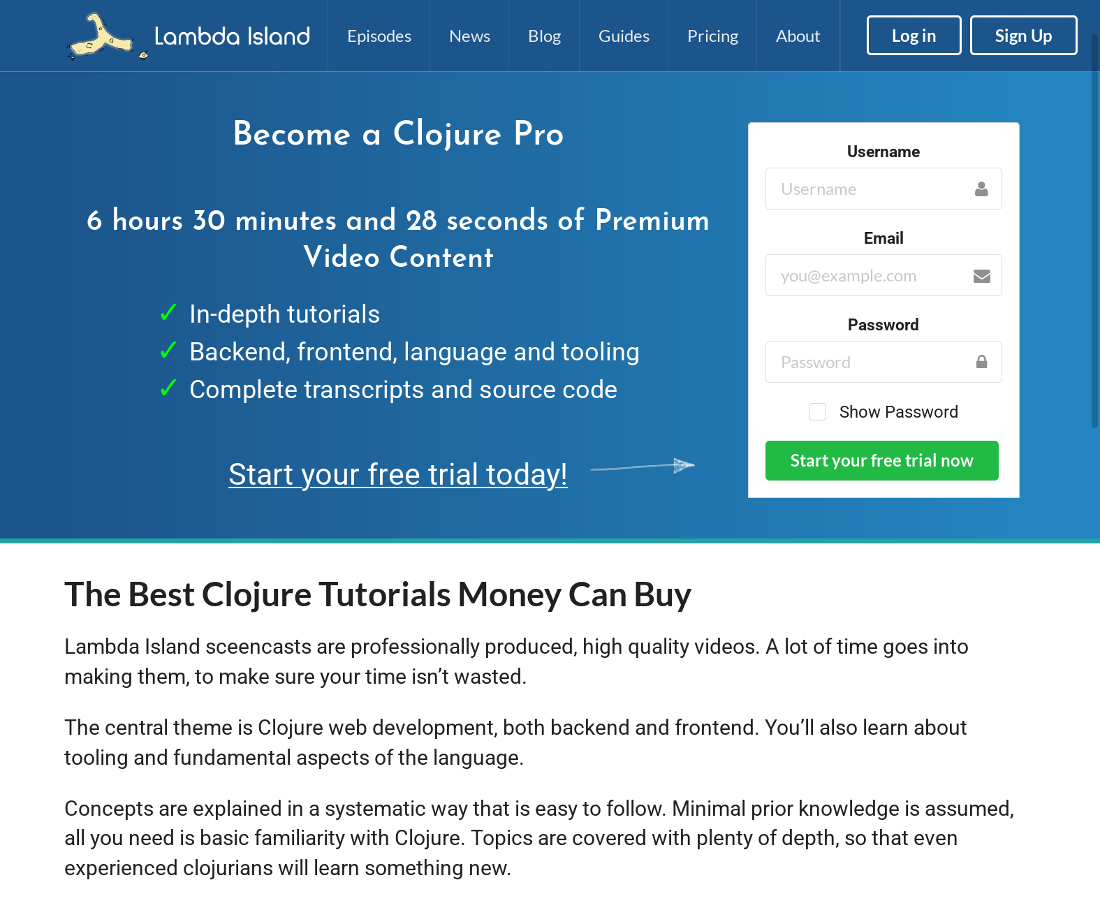
The result is a design that feels contemporary, while avoiding the design clichés of the day. We didn’t want to end up looking like every other website out there. Pages are smaller and load faster, making the result feel snappy and improving SEO. The site now has much improved keyboard navigation; an accesibility improvement that not everyone will notice, but should be much appreciated by the people who do.
On a technical level we also needed a reboot. The original site was styled with Semantic UI and a bit of custom CSS, later changes and additions were done with Tachyons. We had a potpourri of different design systems, and were no longer excited about any of them.
Instead we adopted a less-is-more attitude, writing plain CSS using Garden. Browsers have come a long way, and modern CSS lets you achieve a lot with little. Still, as the project grew we started feeling the need for an organizational system to help us manage the styling for the project. We looked at existing projects, and synthesized all the good ideas we saw into a CSS-components-in-Clojure library which we dubbed Ornament.
We are really happy how Ornament turned out, and hope to release it to the public before long. It combines ideas from CSS-in-JS, BEM, utility classes, design tokens; and builds on Garden and Girouette. We’ve since started using Ornament on client projects and continue to improve and refine it.
As before the site is mainly rendered on the backend. This approach of course doesn’t work for everyone, and there are times when using the web as an application platform instead of a document platform makes sense, but in this case sticking to a traditional HTML-on-the-server approach only presented benefits. There’s a bit of ClojureScript in there, sprinkles with simple DOM manipulation, but that’s it.
We’re not fully done yet, at the time of writing the main thing left in the old design is this blog, and there are some lesser used pages like the 404 and 500 pages which still need an update. But sometimes you have to ship, and then keep shipping. We’ll freshen up the blog before long, and start adding some more improvements as we go along, like better author attribution.
The Gaiwan team is going on a summer break to recharge, so we wanted to get this out before we sign off. We hope you like what you see! We’d love to hear what you think, and answer any questions you may have on our Discord.
Comments ()